企业邮箱
企业邮箱 Chinese
 English


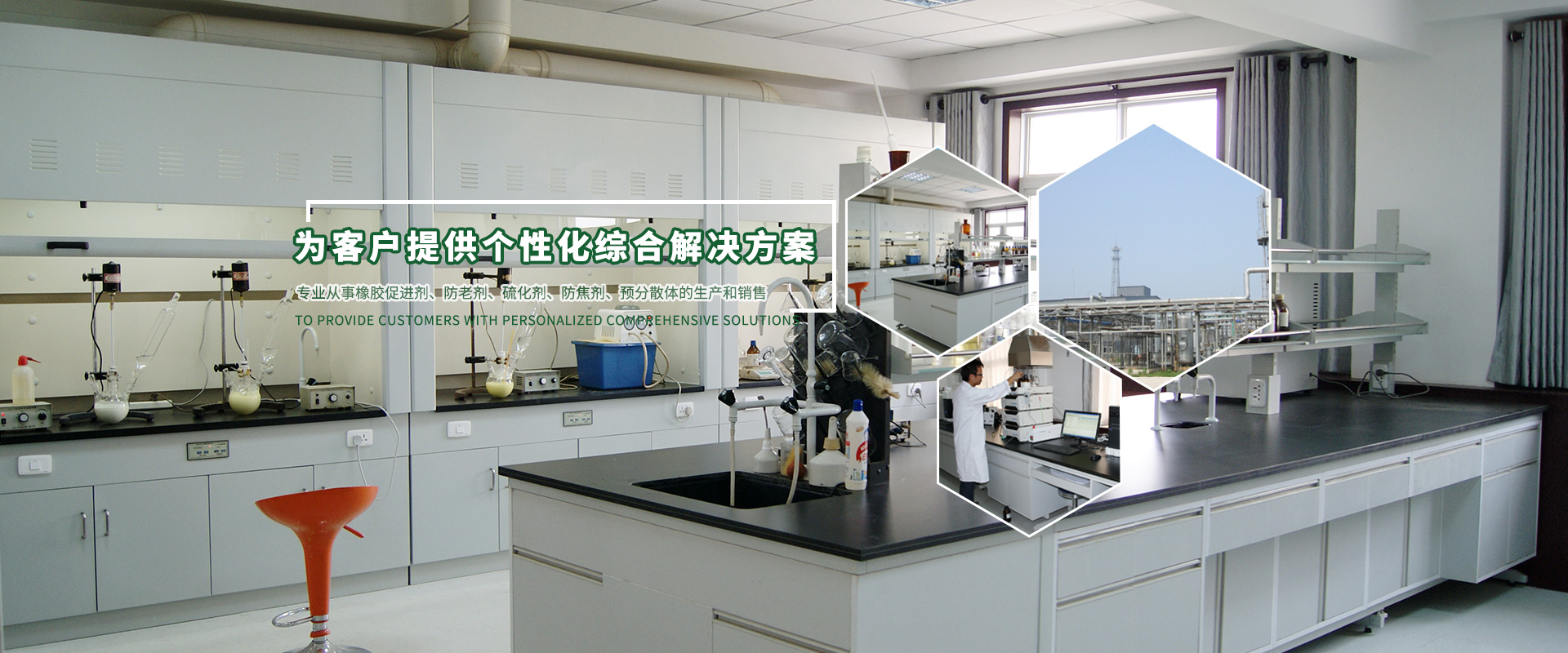
以质量塑品牌,以品牌促发展
技术企业、国家火炬计划重点技术企业、拥有省级企业技术中心


新闻&媒体

技术企业、国家火炬计划重点技术企业、拥有省级企业技术中心


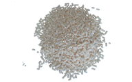
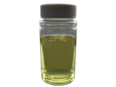
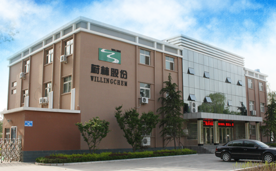
蔚林新材料科技股份有限公司(证券简称:蔚林股份,证券代码:831866.OC)成立于1998年,位于濮阳市化工产业集聚区,专业从事橡胶助剂、特种酚醛树脂及材料、有机化工中间体的研发、生产和销售。公司是国家火炬计划重点技术企业、节能减排科技创新示范企业、质量信用AAA级工业企业。


蔚林股份持续注重研究开发,拥有省级企业技术中心、河南省橡胶助剂工程技术研究中心和河南省博士后研发基地,与华东理工大学化工学院、青岛科技大学、天津大学化工学院、天津科技大学和河南省科学院高新技术研究中心等高校和科研机构建立了稳定的产学研合作关系。