When it comes to graphic design, there’s a magical fusion of artistry and functionality that captivates our senses. Graphic design has the power to convey messages, evoke emotions, and inspire action. In this blog post, we will delve into the 10 principles of graphic design.
Behind every visually stunning masterpiece lies a set of principles that guide designers in creating captivating and impactful visuals. From balance to contrast, and hierarchy to harmony, we’ll explore how these principles can be applied to real-world design projects.
1. Balance – Striking the Perfect Equilibrium
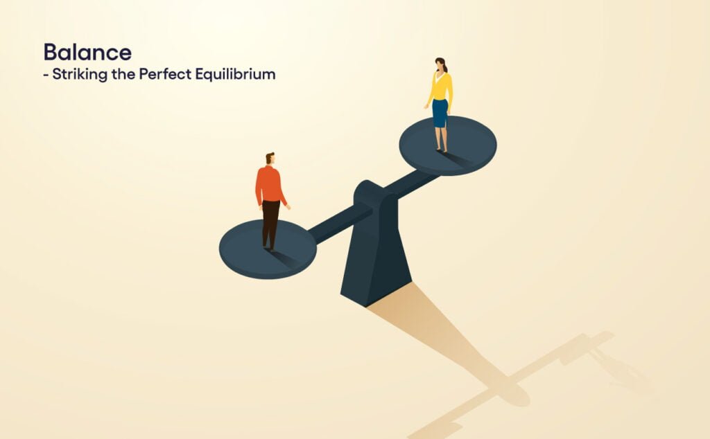
Balance is the cornerstone of visual harmony. It involves arranging elements in a composition in a way that creates a sense of stability and equilibrium.
Whether symmetrical or asymmetrical, balance ensures that no single element overwhelms the others, resulting in a visually pleasing design. Think of a well-balanced logo where each element complements the others, evoking a sense of unity.
2. Contrast – Where Opposites Attract
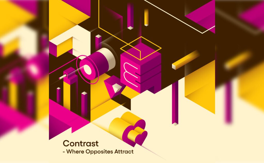
Contrast brings life to the design by highlighting differences between elements. By juxtaposing light and dark, large and small, or bold and delicate, contrast adds visual interest and guides the viewer’s attention.
A simple example would be using a vibrant color against a neutral background, creating a focal point that grabs the eye.
3. Hierarchy – Guiding the Viewer’s Journey

Hierarchy enables designers to establish a visual roadmap for the viewer’s eyes. By assigning different levels of importance to elements through variations in size, color, or typography, designers can lead the viewer’s gaze and emphasize key information. Consider a magazine layout where headlines are larger than subheadings, allowing readers to navigate through the content effortlessly.
4. Proximity – The Power of Visual Relationships
Proximity refers to the distance between elements within a design. By grouping related elements together, designers can establish visual relationships that convey meaning and enhance comprehension.
Whether it’s placing related images near each other or aligning text with accompanying graphics, proximity fosters a sense of cohesion and clarity.
5. Repetition – Harnessing the Strength of Consistency
Repetition creates visual rhythm and strengthens the unity of a design. By reusing colors, shapes, or patterns, designers establish a consistent visual language that unifies different elements.
Think of a website design with the same color palette throughout, reinforcing the brand identity and providing a cohesive user experience.
6. Alignment – Achieving Visual Harmony
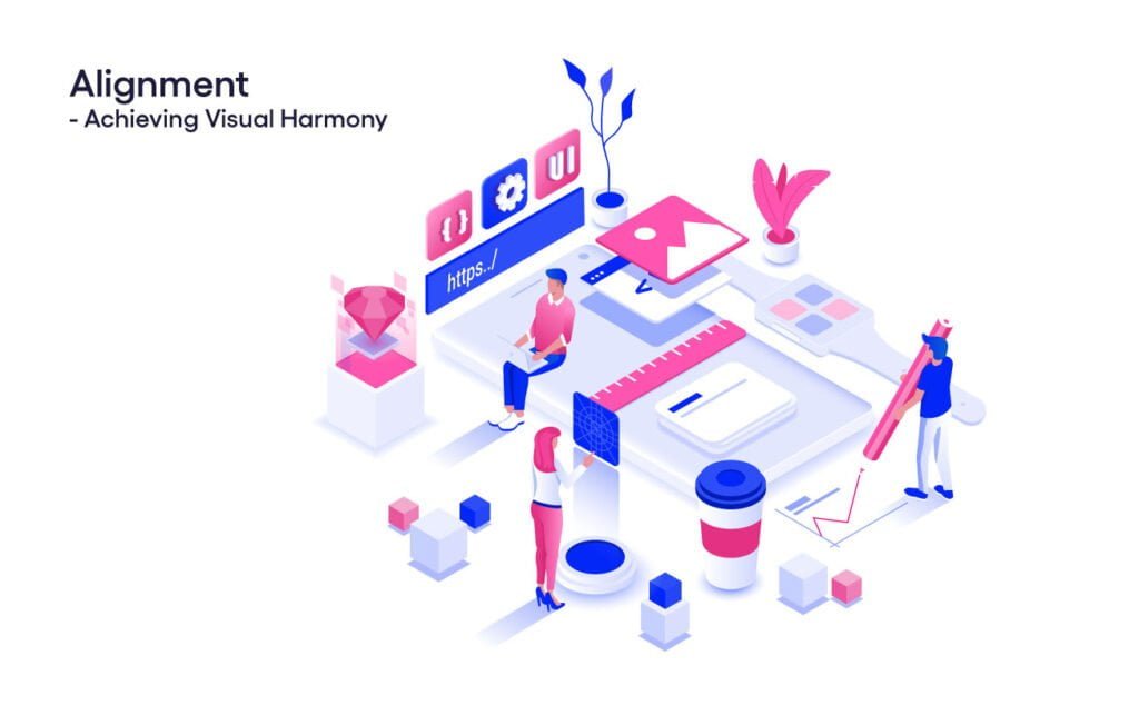
Alignment ensures that elements are properly positioned relative to each other. By aligning elements along a common axis, designers create a sense of order and organization.
Aligning text, images, and other graphic elements allows for easy readability and enhances the overall visual appeal.
7. White Space – The Power of Breathing Room
White space, also known as negative space, is the often-overlooked hero of graphic design. It refers to the empty areas between and around elements. Adequate white space not only provides visual breathing room but also improves legibility, emphasizes important elements, and enhances the overall aesthetic appeal.
8. Typography – The Art of Letterforms
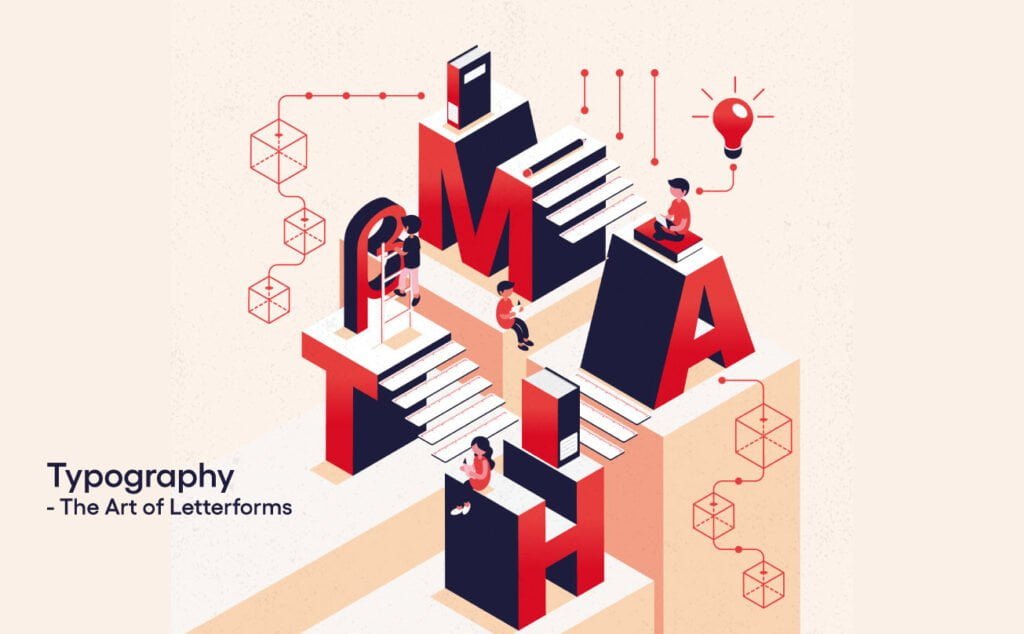
Typography is the art of arranging and styling typefaces. It plays a vital role in conveying information, setting the tone, and evoking emotions.
Choosing the right fonts, spacing, and hierarchy of text can make or break a design. From elegant and formal to bold and playful, typography is a powerful tool that designers wield with precision.
9. Color Theory – The Language of Emotion
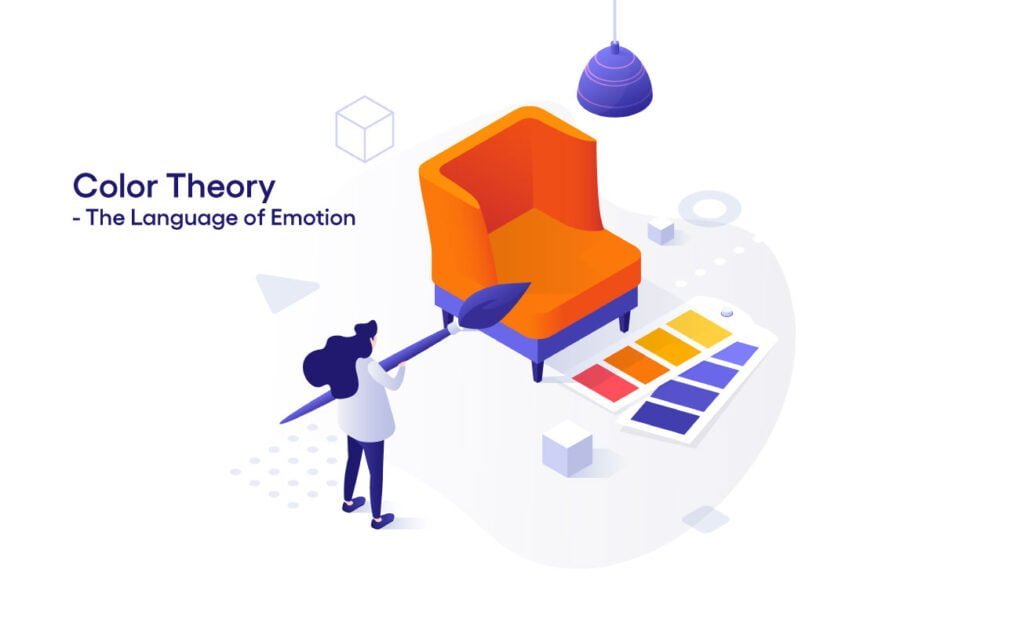
Colors have the ability to evoke emotions, convey meaning, and communicate messages. Understanding color theory enables designers to select and combine hues harmoniously, creating impactful visuals.
Colors can create different moods and feelings, such as using warm colors like red and orange to create a sense of energy and excitement, or cool colors like blue and green to evoke a feeling of calm and tranquility.
10. Harmony – The Art of Cohesion

Harmony is achieved when all the elements in a design work together seamlessly. It involves creating a sense of unity, where every element complements and supports the overall design. By using consistent styles, colors, and shapes, designers can create a harmonious visual experience that is pleasing to the eye.
Real-World Examples of Applying the Principles
Now that we’ve explored the 10 principles of graphic design, let’s dive into some real-world examples to see how these principles can be applied in practice.

Imagine you are designing a poster for a music festival. To achieve balance, you could arrange the main headline at the top center of the poster, with the date and venue information balanced on either side.
By using contrasting colors, such as bold and vibrant against a darker background, you can create visual interest and draw attention to the important details.

For hierarchy, you can make the headline larger and bolder than the supporting text, guiding the viewer’s eyes to the most important information. By using proximity, you can group similar elements, such as the names of the performing artists and their time slots, to create visual relationships and make it easier for the viewer to understand the schedule.

Repetition can be achieved by using a consistent color scheme or pattern throughout the poster, reinforcing the visual identity of the event. Alignment is crucial to ensure that all the text and images are properly positioned and organized, creating a visually pleasing composition.
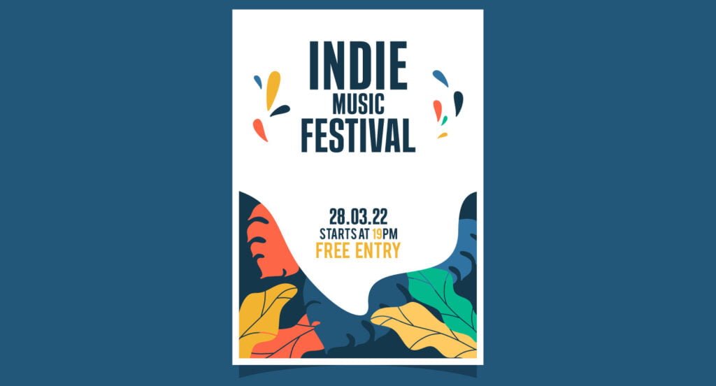
White space plays a vital role in allowing the design elements to breathe and stand out. By leaving enough empty space around the headline and other important details, you can create a sense of clarity and focus.
Typography is key in conveying the tone and style of the music festival. By choosing the right fonts and playing with the size and spacing of the text, you can create a design that matches the genre of the music and captures the essence of the event.
Color theory is essential in creating the right mood for the music festival. For a lively and energetic atmosphere, you might opt for bold and vibrant colors. If the festival has a more laid-back vibe, softer and cooler colors can be used to evoke a sense of relaxation.

Lastly, achieving harmony in the design means ensuring that all the elements work together cohesively. By using consistent styles, colors, and shapes throughout the poster, you can create a visually pleasing and harmonious composition.
10 principles of graphic design help you to stand out
The 10 principles of graphic design are essential guidelines that help designers create captivating and impactful visuals. From balance and contrast to hierarchy and harmony, these principles form the foundation of successful graphic design.
By understanding and applying these principles in real-world design projects, designers can create visually stunning and practical designs that resonate with their intended audience. So next time you embark on a design project, remember to incorporate these principles and watch your designs come to life.