Due to the growing popularity of Dark UI Design, a growing number of programs now include a way to toggle between light and dark modes. However, designing for a dark user interface may be difficult since it necessitates paying close attention to details like color, typeface, picture, and space.
A bad user experience may be the consequence of a mistake in any of these components. If you’re building your first dark user interface, these guidelines should be useful.
What is Dark UI Design?
A user interface that uses a black-and-white color scheme is said to be in dark mode (also known as night mode or lights-out mode). In photography, this kind of contrast might seem like a negative. The letters and other foreground items stand out against the black backdrop.
It gained traction in 2018 when macOS Mojave introduced its dark mode. It’s not a brand-new concept, despite all the current buzz surrounding it. The origins of web design may be traced back to gloomy themes. The “green-on-black” monitors of the 1980s were really only the result of a luminous coating on the interior that gave out a greenish light. However, dark mode is still widely used even though color monitors have been around for a while.
The dark mode is available across all platforms, from mobile to desktop to smart TV. Google and Apple, two of the biggest IT businesses in the world, have already used it in their user interfaces. We also can’t ignore video-sharing websites like YouTube and Twitter.
These are the rules to follow when designing a dark theme for the best possible user experience (UX). Here are 13 tips for designing in dark mode, along with the benefits and downsides of doing so.

Tips for Creating a Dark UI Design
1. Don’t Use Pure Black
Pure colors are ones that don’t include any shades of gray. Some common colors include black (#000000) and white (#FFFFFF). When making dark themes, they might be tempting to employ since inexperienced designers may assume that all it takes to make a dark theme is to use a black backdrop and white font. However, if the contrast between the foreground and backdrop is too great, it will be distracting.
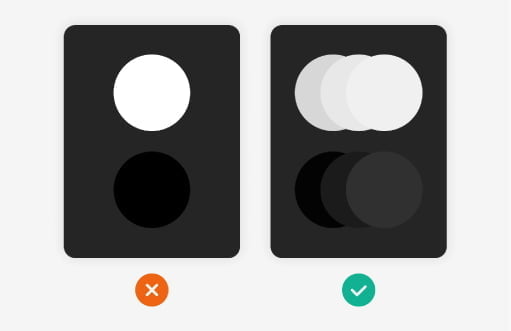
The best course of action is to switch to shades of gray other than black and white. You’re free to use as many shades of gray as you want. Grayscales may be made to seem quite similar to the brand’s main hue if that’s what you’d want to do.
2. Do not use pure white typefaces
When it comes to using a dark user interface, the quality of the text may make or break the whole thing. We need to plan how to make your text as efficient as possible (or as invisible as possible). Use opacity for the best results.

On the other hand, when set against a black or dark gray backdrop, pure white typefaces may not be the best choice. First, most displays distort or blur completely white text on a black backdrop.
This optical illusion occurs when the white light from the screen seems to expand until it completely fills the surrounding darkness. If you must use typefaces, choose ones in dull white or light gray.
According to Google, the optimal values for disabled, medium-emphasis, and high-emphasis letters are 38%, 60%, and 87% opacity of light gray, respectively.
3. Never use shadows in Dark UI Design
The primary function of shadows in a user interface is to provide a subtle elevation effect, making it immediately apparent which elements are front and which are background. Everything goes swimmingly in a bright theme, as a white backdrop and a black shadow get along famously.
But what occurs in a bleak setting? There won’t be much difference between a black backdrop and a black shadow, leading you to believe one of the following. Regrettably, they almost seldom prove useful:
- Keep the shadow from standing out too much from the backdrop. It’s easy to fall into the trap of thinking “Of course, that shadow is visible” since the backdrop was a dark gray and the shadow was pure black. But no one will be able to see your shadow unless they make an effort and have excellent vision. Certainly not for the purpose for which it was designed.
- Make sure the shadow isn’t brighter than the thing. To do this, a peculiar user interface is necessary. When was the last time you saw anyone provide light instead of darkness? all does provide some contrast, but that’s about all.
4. Avoid Saturated Accent Colors in Dark UI Design
Light settings take into mind the readability of letters, symbols, and buttons. Keeping the color palette from becoming too “neon” (which will simply make readability tougher) is more challenging when working with dark backdrops.
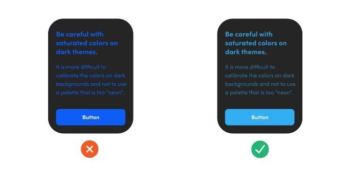
When developing an interface, we must remember that any given hue will stand out much more in dark mode than in normal light.
Extremely bright, intense colors should be avoided at all costs. We also need to run the appropriate checks to ensure the hues are easily accessible.
5. Maintain your brand’s unique identity
Keeping the same mood in both the bright and dark UIs makes it logical, however, the latter may evoke quite distinct emotions from the former. A brand’s voice has to change to reflect the gloomy setting. It’s important to strike a balance so that, even with new hues, the intended palette feelings are conveyed.

It might be difficult to successfully convey the same feeling using the same color scheme in both circumstances, so you should explore various emotional avenues for each.
What if you expose the shadowy aspect of your brand? It has the potential to be fascinating and provide new dimensions of depth and breadth to your product’s brand identity.
6. Make good use of brand colors
You don’t need to use the same colors as in the light mode to keep the brand identity intact while viewing the site in dark mode. If possible, it’s best to change your color scheme to fit the dark mood.
This, however, does not need the use of extraordinary measures like color inversion. Only one or two items, such as a button or a logo, should utilize the saturated main color. And then utilize that muted version of the interface’s main color wherever else.
7. Meet standards for color contrast and usability
The notion that “aesthetics come second to usability” is a good one to follow while designing themes. However, there is a more pressing concern: convenience. You may kill two birds with one stone by making sure your site complies with accessibility standards.

You improve the product’s usability and save yourself the trouble of determining which color values would provide the best contrast. Tools like Accessible Colours provide accessibility recommendations. The WCAG 2.0 standards served as inspiration for this.
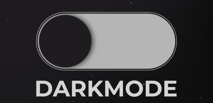
8. Allow dark mode switching
Some websites and applications include a “night mode” that automatically activates at particular times of the day or on specified days (like Halloween, which would be appropriate for gloomy aesthetics). That’s handy, but it’d be much better if the user could toggle between modes on their own.
- You allow them to choose the future of your product. Because it gives the consumers a sense of agency while still ensuring their security, customizability is often the top-selling feature.
- In continuation of the preceding thought, allowing the user to toggle a setting would demonstrate respect for the user’s individual tastes and preferences.
That’s how you appease those who want bright colors and others who prefer darker ones.
9. Explain complex ideas
The use of a flat layout is not required for a dark design. The visual hierarchy of the interface must also be made clear to the user. What alternatives do we have if we decide that dark mode shadows are not the best choice for our design? We rely on a number of robust tools, including:

- Make good use of empty space. Simpler is better: Darker colors are easier on the eyes but still send your users searching for something bright, so you’ll need to provide them with visual breaks, an adaptable design, and enough white space. An excellent moment to simplify your design for both light and dark settings is, well, now.
- Take the use of contrast and lighting. You may get the attention you desire by starting with the backdrop and gradually drawing it into a landscape of brighter or richer colors of grey. You may get the impression of depth without using shadows thanks to the contrast between the objects.
10. Look at your library of images
Make sure the photos on your site are black enough to blend in when designing and implementing a dark mode. Do not be afraid to make changes to your photographs to improve their appearance in the dark theme.

If the difference between the dark mode and the picture is too jarring, you may use a general filter that modifies the display’s contrast and brightness.
11. Have real clients try out your design
Designers struggle with dark mode since it’s impossible to predict what users will see due to the wide variety of users’ individual lighting environments. Because of this, predicting their reaction to the bleak setting and behavior is challenging.

12. Utilise Negative Space to Avoid Developing a Bulky UI
Users may feel overwhelmed by a too-dark user interface. Negative space is a powerful tool for drawing attention to key UI components and facilitating quick reading. Adequate white space may also help provide a more organized and contemporary look.
Consider the homepage of Apple, for instance. Having white space between items gives the website a contemporary appearance and helps draw the eye to the most crucial parts of the page.
13. Make sure text contrast complies with WCAG 2.0 requirements
Pick a color scheme with enough contrast to make the text readable. According to the Web Content Accessibility Guidelines 2.0 (WCAG 2.0), the minimum contrast ratio for text or pictures of text is 4.5:1, while the minimum contrast ratio for big text (at least 18 points or 14-point bold) is 3:1.
Benefits of Dark UI Design
What makes dark mode such a hit that some people think it should be standard in every app? The five most important reasons for its widespread acclaim are listed below.
1. It reduces strain on the eyes
Just picture yourself waking up and reaching for your phone. It’s most likely the light interface’s sudden glare in the dim surroundings. It’s too sudden and shocking for your eyes. Nighttime screen time requires some adjustment time. Another major benefit of switching to dark mode is reduced sensitivity to light. That’s where the brands come in:
That may explain dark mode’s rise. Blacks and greys lull you into not putting your phone aside. Twitter discovered that dark mode increased app use. Your screen-staring-dried-out eyes are less noticeable.
Mehedi Hasan- CEO, DsgnStory
2. Keeping up with the trends
The use of dark themes is widespread. The design team that is most in tune with current trends will likely suggest creating a bright and dark theme for the app. Here, accommodating a wide variety of tastes is of paramount importance.
Many people still choose the standard light theme, but the dark UI is gaining popularity. We can’t afford to disregard the rising trend of consumers using their phones exclusively in night mode. It seems that younger users have made their decision: they always wager on black.
3. Provides additional options
Dark user interfaces, when properly developed, may benefit from color contrast standards that make apps more user-friendly. However, some people may find dark themes more difficult to utilize.
Dark mode users (sometimes known as “dark thinkers”), however, argue that this kind of interface is preferable even during daylight hours. Both of these methods of communication owe much of their success to the preferences and routines of their users.
More than the design quality of dark mode, users’ individual circumstances, objectives, context, and health will decide their preferences. Take this one specific case:
Dark Mode helps swiftly scan a screen for visual/colored features. In 2018, DSGNSTORY designers wondered what mode was ideal for dashboard feature development. Dark Theme charts helped consumers make quicker, more accurate judgements.
Farzana Toma, writer from “UX Collective”
4. It helps preserve battery life
If your phone has an OLED display, you may save even more juice by switching to the dark mode. YouTube in dark mode may extend battery life by up to 15% as compared to light themes when the screen brightness is set to 50%.
If something is not only fashionable but also functional, then there is no reason to ignore it. The fact that a darker theme might save battery life is welcome news for many smartphone users.
5. It reinvents your brand
In marketing, it’s standard practice to try to imagine your product or brand as a fictional character. What do you think? What does it prefer? What language does it use? Which impression does it give?

When we apply this logic to our own product, app, or website, we get the same effect. Imagine your light setting as if it were an early riser.
Imagine that your user interface (UI) is a night owl; how would it act? It might give off an air of exclusivity and modernity, mystery and gravity. Just consider all the good that may come from making this adjustment.
Negative Aspects of Dark UI Design
When using a Dark UI, not everything will be in the spotlight. It also has some negative aspects to it. Here are five situations in which a dark mode may not be the best option:
1. Confined color scheme
It’s not a good plan to use every color in the spectrum in our black mode layout. Keep in mind that simplicity is key and that form should follow function. In a gloomy setting, this restricts us to a very small set of colors. This might perhaps be a fortunate turn of events for minimalist architects and designers.
2. It might be tiring on the eyes
Despite dark mode’s widespread plaudits for reducing eye strain, a number of research published between 2013 and 2016 reveal the contrary to be true. In addition to increasing eye strain, the tests found that dark mode reduced reading accuracy. Reading comprehension suffers when light letters are placed on dark backgrounds.
3. Sadness and gloom
The absence of illumination is thought to be at the root of another issue with the dark mode. Prolonged durations without exposure to light may contribute to depression, according to studies conducted in northern latitudes such as Finland, Norway, and Alaska. Some doctors are worried that those who spend most of their time indoors (such as those who work in call centers) won’t get enough sleep because of dark mode. This is a very drastic measure to take.
4. Ability to be Seen in Daylight
The inability to read in bright light is a serious problem that Dark Mode does little to address. Although it may seem obvious, the gadget that is meant to be your constant companion should be optimized for usage in broad sunlight and have a consistent design aesthetic to make the material simple to see.
When to Use a Dark UI Design
Using a dark user interface design is a terrific approach to give your website or app a more contemporary look. Battery life may be extended and the risk of eye strain reduced. However, black user interfaces aren’t appropriate for every software; you should always keep your target audience and brand in mind.
Dark user interfaces are often preferred by high-end, minimalist, mysterious, or other similarly themed firms. They are also a good option for use in visualization software and dashboards.