CarDark was seeking a brand identity that would set them apart in a competitive market. They needed a logo that could convey their dedication to top-notch automotive services while encapsulating their mission to keep clients moving forward.
Approach:
1. Discovery Phase:
We began by immersing ourselves in CarDark’s values, goals, and customer experiences. Our team conducted in-depth research into the automotive industry and the visual identities of competitors to identify unique opportunities.
2. Conceptualization:
Drawing inspiration from CarDark’s commitment to progress and seamless customer experiences, we developed a concept that revolved around a custom typography-driven logo.
3. Typography and Symbolism:
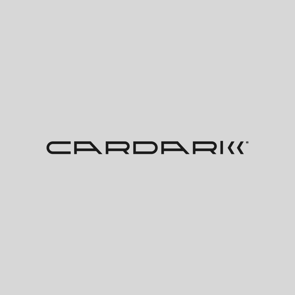
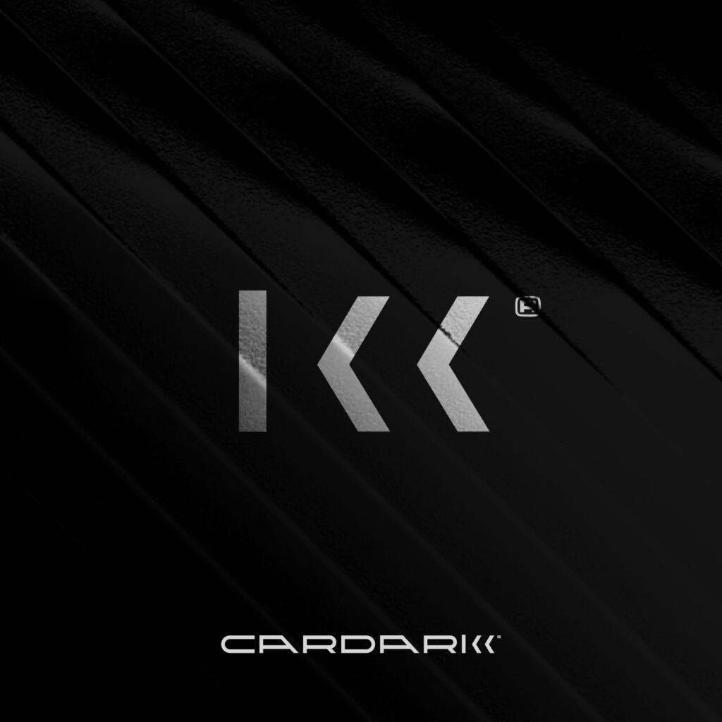
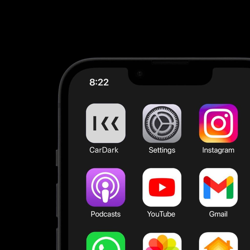
Our expert designers crafted a bespoke font that exuded professionalism, mirroring the precision that CarDark brings to their services. The focal point of the logo was the letter ‘K’, creatively designed with a vertical line flanked by two arrow symbols. This ingenious element conveyed both forward movement and reliability, aligning perfectly with CarDark’s values.
4. Versatility:
Understanding the importance of versatility, we ensured that the logo could be effortlessly adapted across various platforms, from print materials to digital media. It was designed to be impactful whether displayed with or without the iconic ‘K’ element.
Results:

1. Distinct Brand Identity:
The new logo stands as a testament to CarDark’s dedication to precision and progress. The custom typography, coupled with the innovative ‘K’ symbol, conveys a sense of professionalism and reliability.
2. Brand Recognition:
The logo has quickly become a recognizable emblem, symbolizing the trustworthiness of CarDark’s services in the minds of clients and industry peers alike.
3. Market Differentiation:
CarDark has successfully set themselves apart from competitors with a logo that communicates not just their services, but their values and commitment to customer satisfaction.
Conclusion:
The transformation of CarDark’s brand identity by DsgnStory Branding Agency has been a resounding success. The logo encapsulates the essence of CarDark’s mission, combining innovation, reliability, and progress. It’s not just a logo; it’s a visual representation of their dedication to keeping vehicles and clients on the move, always forward.


