The primary challenge was to craft a brand identity that resonated with RapidWeld’s values while creating a strong visual impact in a competitive industry. Our task was to design a logo that would encapsulate the essence of welding craftsmanship and evoke a sense of reliability and cutting-edge technology.
Solution:
DsgnStory embarked on a comprehensive branding journey to create a distinctive identity for RapidWeld. We understood that the initials “R” and “W” held significant potential as the basis for the logo, and our strategy revolved around harnessing this potential.
Logo Design:
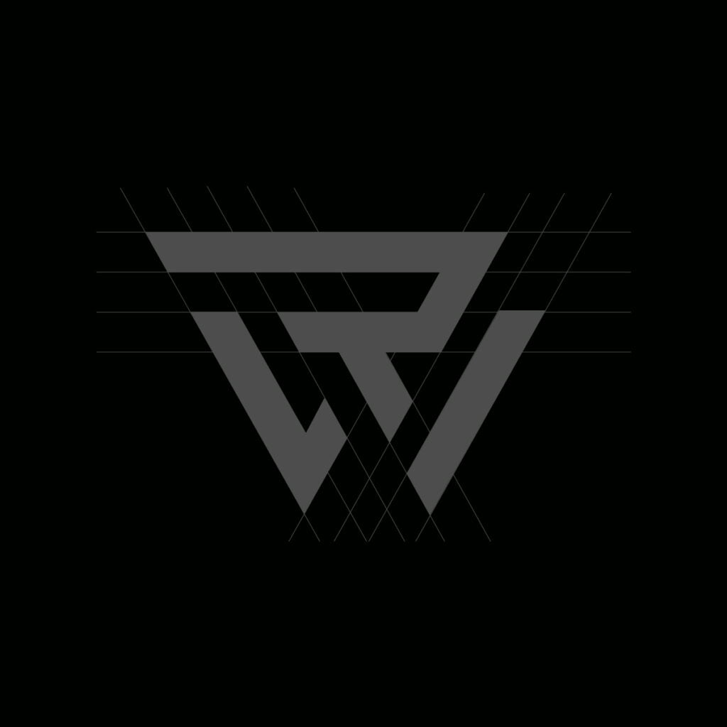
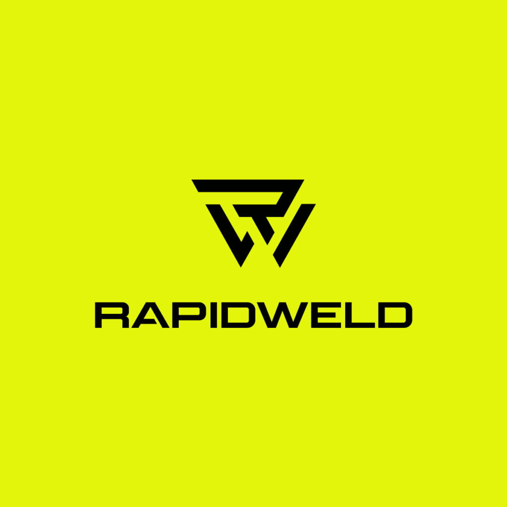
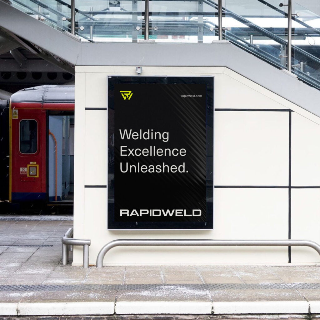
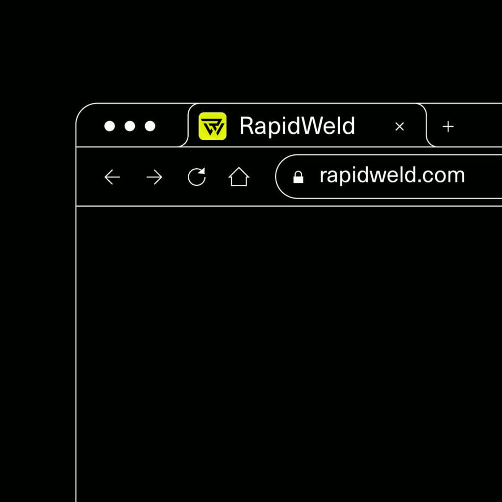
The heart of the branding solution was the creation of a custom icon using the initials “R” and “W”. The icon merged these letters in a seamless manner, forming a cohesive unit that symbolized the fusion and strength that RapidWeld represents.
The unique design exuded a sense of precision and craftsmanship, reflecting the company’s dedication to quality welding work.
Typography:
For the typography, DsgnStory developed a custom font that perfectly complemented the logo. The font was carefully crafted to convey a sense of robustness while retaining an element of modernity. It ensured that the brand’s personality was reflected not just in the logo, but in every textual aspect of the brand’s identity.
Color Palette:
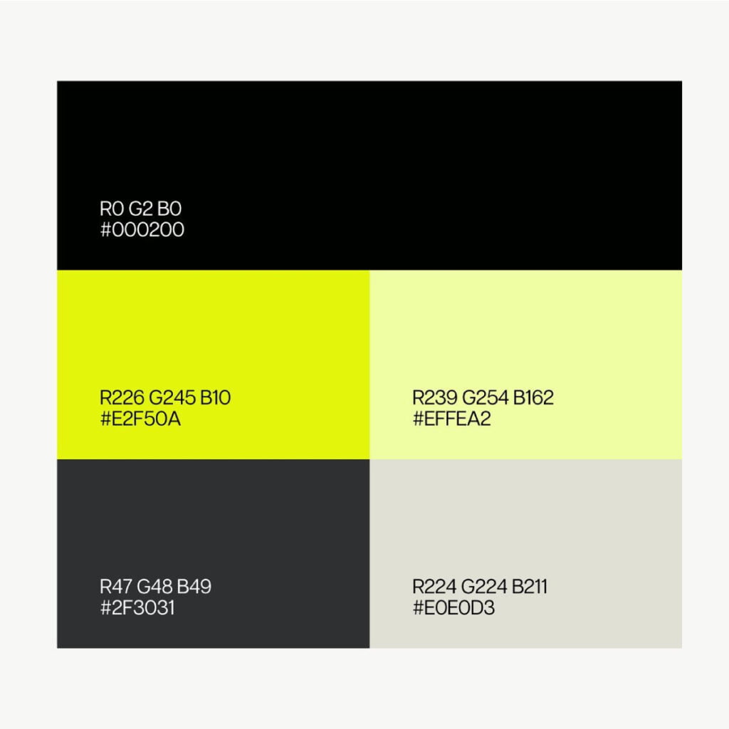
To further establish the brand’s identity, a carefully selected color palette was employed, centered around the primary colors #e2f50a and #000200. These colors were chosen with intention and purpose, representing the core values of RapidWeld.
The bold and vibrant #e2f50a shade exudes energy and innovation. It symbolizes the dynamic nature of RapidWeld’s work, conveying their commitment to pushing boundaries and embracing modern techniques. This color radiates positivity and growth, reflecting the company’s forward-thinking approach.
Complementing the vibrancy of #e2f50a, the deep and rich #000200 color brings a sense of strength and solidity to the palette. It represents the foundation of RapidWeld’s craftsmanship and the enduring quality of its welding work. This color speaks to the precision and reliability that clients can expect when partnering with the company.
Together, this color combination captures the essence of RapidWeld’s brand identity, striking a balance between innovation and tradition. The palette resonates with clients and partners alike, ensuring that the brand’s visual identity communicates its core values effectively across all brand materials and touchpoints.
Outcome:
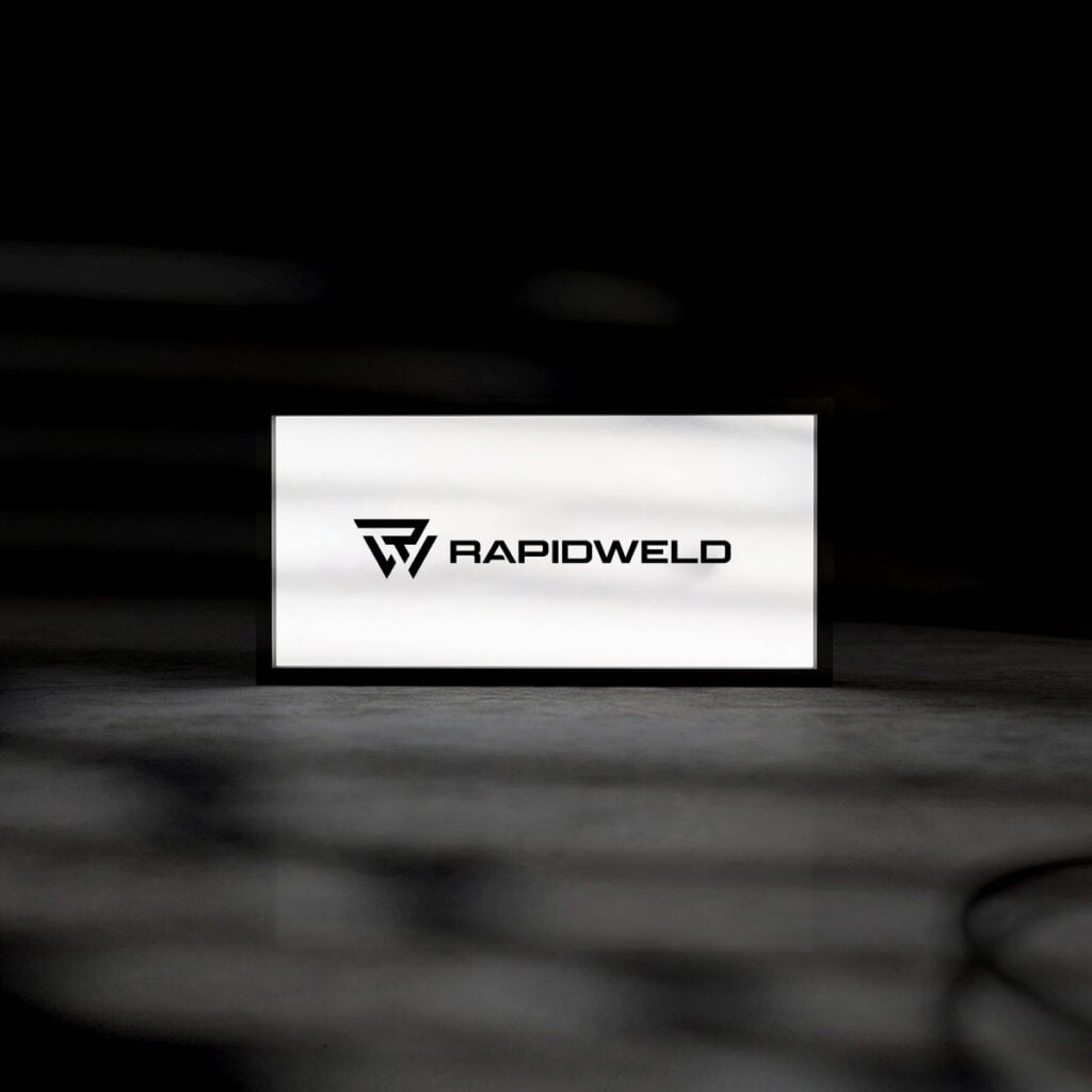
The result of the collaboration was a brand identity that stood as a true representation of RapidWeld’s values and expertise. The logo, with its iconic “R” and “W” fusion, became a memorable symbol of the company’s commitment to welding excellence.
The custom font and color palette tied together the brand’s personality and message, ensuring consistency across all touchpoints.
Impact:
The new brand identity revitalized RapidWeld’s market presence, positioning them as a leader in heavy welding. The logo’s uniqueness and striking design caught the attention of potential clients, making a powerful first impression and instilling confidence in the brand’s capabilities.
RapidWeld’s renewed brand identity facilitated stronger connections with clients and partners, as it communicated not just the company’s technical prowess but also its dedication to progress and innovation.
Conclusion:
DsgnStory’s collaboration with RapidWeld showcases the transformative power of thoughtful branding. By harnessing the potential of the initials “R” and “W”, we created a visual identity that truly encapsulates the essence of welding craftsmanship and the company’s commitment to excellence.
The success of this project demonstrates the impact of a well-crafted brand identity in making a lasting impression and setting a company apart in a competitive market.


